Getting your custom car’s colour scheme right can have one of the biggest impacts on the success of your build. Only stance (and some would argue, wheel choice) will have a bigger impact. This includes the interior colour as much as the paint; if they don’t work together, you’ll immediately ruin the appeal. You know, sometimes you’ll spot that car at a meet or show that kind of looks cool, but there’s just something about it that isn’t right. Oftentimes, that’s the result of poor colour choice. So how do you stand out from the crowd, but for the right reasons? Let’s first look at how colours work together, before looking at some useful tips to help nail a killer custom car interior colour scheme.
Colour theory
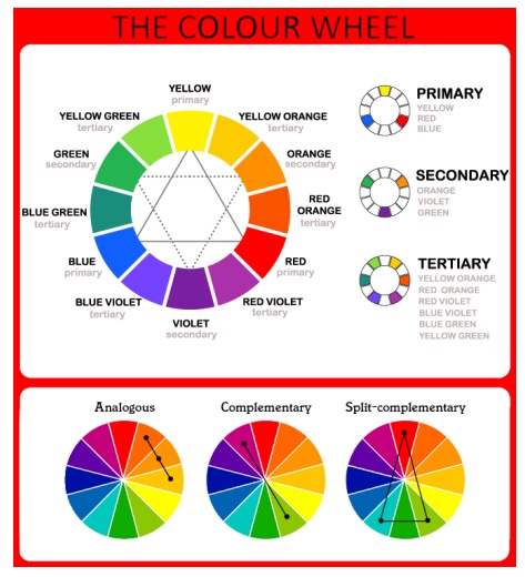
Painters, designers and artists often use a colour wheel to help make colour choice easier in terms of what the brain instantly interprets as working together. This is colour theory. Let’s look at how colour wheels work, starting with the four types of colour.
Primary colours are your three basic colours – Red, Blue and Yellow. They form the basis of the wheel.
Secondary colours are what you would get if you were to mix two primary colours in equal amounts – Violet, Green and Orange
Tertiary colours, also known as intermediate colours. These are what you would get if you were to mix a primary colour with its nearby secondary colour. In colour wheel terms, this gives you six colours; Red-violet, Blue-violet, Blue-green, Yellow-green, Yellow-orange, and Red-orange
Neutrals are not actually colours at all, and so work visually with any of the colours on the colour wheel. These are Black, Grey, White, Brown and Beige. Any of these “colours” make a great pairing with whichever colour scheme you happen to be using.
How colour theory works
Now, let’s get into how these colours work together
Analogous colours span from one primary colour to an adjacent primary colour, inclusive. Using colours from a “family” like this guarantees that they are harmonious.
Complementary colours are the two colours directly opposite each other on the colour wheel. As the name suggests, they complement each other. This makes this combination a safe bet. An example of this would be Blue and Orange.
Split complementary colours are a safe way to go tri-tone, and use both colours either side of the main colours directly opposite. For example, you could use Green, Red-Violet and Red-Orange.
Tips
Some handy tips to get you started:
- You can get a rough idea of some colour concepts by visiting your local Bunnings (DIY) store and grabbing a handful of the paint colour cards available. Play with different combinations until you have a general idea of what you like.
- Choosing your trim materials before locking in your paint colour may end up with a better result without as many compromises. While paint can be mixed to any possible colour of the rainbow and any shade or tone in between, vinyls and cloth choices are limited by comparison. It is possible to have leather custom dyed, but you need to check whether your chosen trim shop will organise this for you. But be prepared that this service can be expensive, especially as there may be a minimum order quantity.
- When choosing colour don’t be led by trends or by predetermined colour tastes. Forget about whether you think certain colours work well together. Ask yourself how you feel about those colours individually, then lay available samples next to each other to get a feel for the combination – try to get ratios close to how they’ll be used.
- Often, less is more. Two tone interiors work well, and with the right combination, tri-tone can work too. But using more than three different colours in a car’s interior can get very busy looking – the area just isn’t large enough for too many colours to work visually.
- Rather than using multiple colours try playing with various shades of the same colour, for example two different greys. Or you can go for a monotone colour scheme. With monotone, you can create interest and help to break up the space by using different textures. Try using a glossy, smooth leather with a semi-gloss leather of more pronounced grain, combined with an Alcantara or other synthetic suede.
- Mixing light and dark tones add interest and a touch of energy. A light car with a dark interior works well, especially if you pick up highlights of the external colour. Obviously, vice versa would also work.
For more useful information, download Preparing for your custom interior.